
GitHub 项目地址:weibo-analysis
这次的数据用的是本科期间就已经爬好,但因为当时没有足够的处理技巧,这些数据在硬盘里一丢就是两年。如今,本Python初丁趁着还有机会摸鱼,赶紧把数据翻出来,让它们发光发热。
文本获取
因为新浪微博的严防死打,现如今微博的数据越来越不好爬。GitHub上的微博爬虫生存周期通常都很短,使爬取数据的成本大大增加。这里我用的是微博@失眠狸 同学的方法,用鼠标精灵写了个插件,控制快捷键和页面拖动,把内容从浏览器上粘贴到sublime里。
生成csv文件
有了原始数据,接下来我们要把数据归一化,做成方便处理的数据。一个常用的方法就是将数据整理成csv文件。
Step 1. 分析需要保存的字段以及数据的维度,从而设计出数据的存储结构。根据原数据,我划分了五个字段: id, date, time, device, content, 它们分别记录一条微博的文件位置、发布日期、发布时间、发送设备和文本内容。
Step 2. 分割raw data. 先用split函数进行粗略分割,再用find函数精确分割。接着将分割好的内容提取到各字段,并依次存入csv。
经过上述两步,数据的整理工作就做完啦。
可视化微博数据
有了csv文件,做数据可视化是分分钟的事。此时我把工作平台从PyCharm搬到了Jupyter Notebook。这是因为Jupyter Notebook可以制作的各式各样的可视化图表和窗口小工具(widget), 比PyCharm更适合数据处理。至于工具包,这里我选的是pandas和seaborn.
首先是需求分析,我的目标如下:
-
绘制日期分布热力图,观察今年使用微博频率的趋势
-
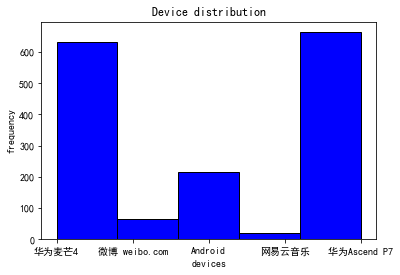
绘制设备使用直方图,看看平时最常用什么平台发博
-
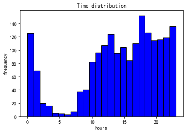
绘制时间分布直方图,观察一天之中各时段的发博频率
-
使用窗口滑块小部件,拖动查看各个时间段都发了什么内容
这里不描述具体过程,详见GitHub Repository.
分析结果如下:
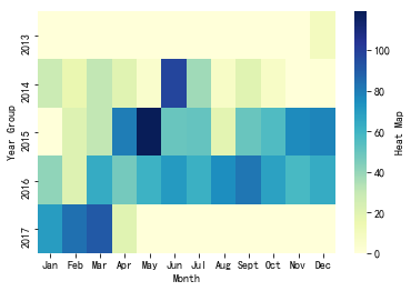
热力图总体来说颜色逐年加深,说明我正在逐渐成为一个微博控。而且注意到往年年初我是不怎么玩微博的,但随着年纪渐长,1-3月份我玩微博的频率越来越高,这意味着过年可能越来越无聊,没有年味,从而加长了我混迹微博的时间。
是你吗?华为的舔狗~
晚上2点不睡的坏小孩,早上10点起的偷懒者。(此处是一个卑微的笑容)
附录:部分代码
下面这段代码分割了文本。
    def classification(self, txt_array, file_index):
        id = np.array([])
        date = np.array([])
        time = np.array([])
        device = np.array([])
        content = np.array([])

        count = 0
        for ite in range(1, np.size(txt_array), 1):
            if txt_array[ite].find("\n"+"YOUR_NAME") != -1:
                cur_sentence = txt_array[ite][txt_array[ite].rfind("\n"+"YOUR_NAME") + len("\n"+"YOUR_NAME")+1:txt_array[ite].find("\u200b")]
                count += 1
                id = np.append(id, str(file_index) + '.' + str(count))
                device = np.append(device, cur_sentence[cur_sentence.find("come from") + 10:].split("\n")[0])
                content = np.append(content, str(cur_sentence[cur_sentence.find("\n") + 1:]))
                if cur_sentence != '':
                    start = cur_sentence[0:11].rfind("-")
                    end = cur_sentence[0:16].rfind(":")
                    date = np.append(date, cur_sentence[0:start+3])
                    time = np.append(time, cur_sentence[end-2:end+3])
                else:
                    date = np.append(date, '')
                    time = np.append(time, '')


        flag = 0
        if count != len(time):
            print("Error: time and sentence do not have same size in file {}".format(str(file_index)))
            flag = 1
        if count != len(device):
            print("Error: device and sentence do not have same size in file {}".format(str(file_index)))
            flag = 1
        if count != len(content):
            print("Error: content and sentence do not have same size in file {}".format(str(file_index)))
            flag = 1

        if flag == 1:
            id = np.array([])
            date = np.array([])
            time = np.array([])
            device = np.array([])
            content = np.array([])

        return id, date, time, device, content
下面这段代码绘制了热力图。
year_group = '2013', '2014', '2015', '2016', '2017'
month_group = 'Jan', 'Feb', 'Mar', 'Apr', 'May', 'Jun', 'Jul', 'Aug', 'Sept', 'Oct', 'Nov', 'Dec'

values = np.zeros((len(year_group),len(month_group)))
for i in range(new_dates.shape[0]):
    for year in range(len(year_group)):
        for month in range(len(month_group)):
            if new_dates[i, 1] == year_group[year] and new_dates[i, 2] == str(month+1):
                values[year, month] += 1

ax = sns.heatmap(values, xticklabels=month_group, yticklabels=year_group, cmap='YlGnBu', cbar_kws={'label': 'Heat Map'})
ax.set(xlabel='Month', ylabel='Year Group')
下面这段代码绘制了设备使用直方图。
plt.hist(new_device, bins=5, facecolor="blue", edgecolor="black")
matplotlib.rcParams['font.sans-serif']=['SimHei']

plt.xlabel("devices")
plt.ylabel("frequency")

plt.title("Device distribution")

plt.show()